Facegiving
Before the logo: five questions we ask every new brand
A logo is the last thing a brand needs. These are the first.
Every new brand project starts with someone asking for a logo. It is a reasonable request: the logo is the part everyone can see. But a logo is a conclusion. Drawn before the thinking is done, it becomes a decoration that the rest of the brand has to work around.
So before we draw anything, we ask five questions. None of them are about shapes.
1. Who is it for, really?
Not “everyone” and not a demographic. We want a person: what they are doing when they meet the brand, what they already use instead, and what would make them notice something new. A bakery for commuters at seven in the morning and a bakery for weekend brunch need different brands, even if they sell the same bread.
2. What does it believe?
Brands that last stand for something specific enough to disagree with. “Quality” is not a belief; every competitor claims it. “Food should be made where you can see it” is a belief, and it immediately suggests an open kitchen, a typeface, a tone of voice and a way of photographing the product.
3. How should it feel?
We ask for three words, then we ask what each word is not. “Warm, but not cosy. Confident, but not loud. Local, but not folkloric.” The second half of each pair is often more useful than the first, because it tells the designer where the edges are.
4. Where will it live?
A brand that lives mainly on a phone screen needs to work at the size of a thumbnail. One that lives on a shopfront in Valletta needs to work in stone light and shadow. One that lives on stage needs to move. We list every place the brand will appear in its first year and design for the hardest one first.
Design the brand for the smallest, busiest and most moving place it will appear. The large, calm places look after themselves.
5. What must it never be?
This is the question clients enjoy most. Every business has a competitor it does not want to resemble, a cliché of its industry it is tired of, or a past version of itself it is leaving behind. Writing those down early saves weeks of work later.
Then the logo
By the time we answer these, the brief for the logo has written itself. The mark usually becomes simpler, because it no longer has to carry the whole brand on its own. Colour, type, photography, motion and language share the load.
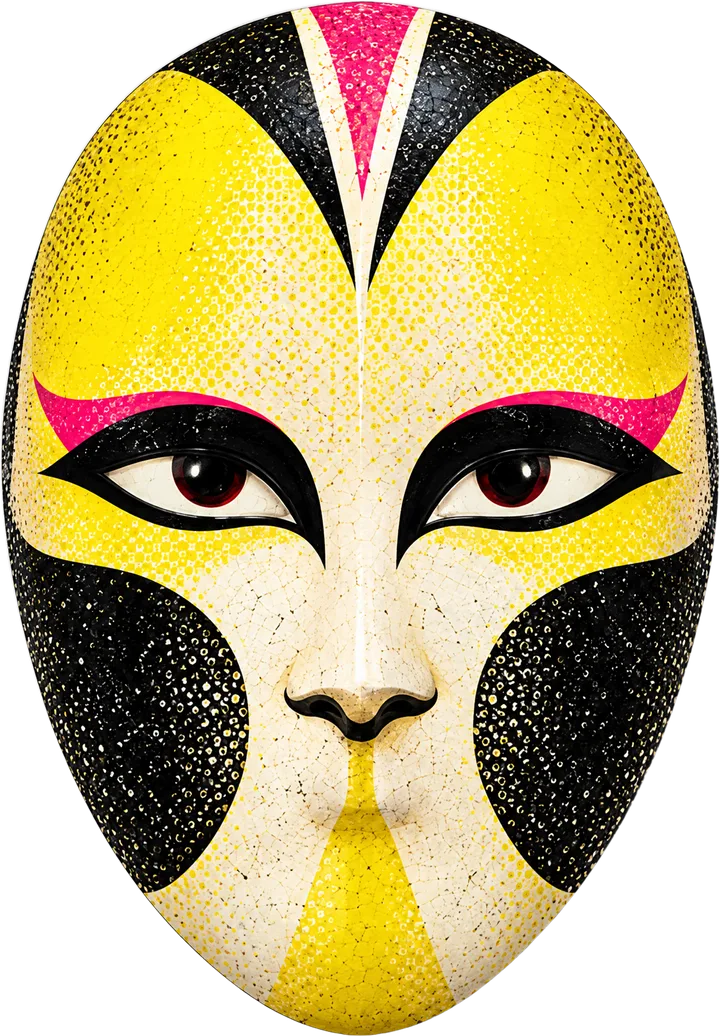
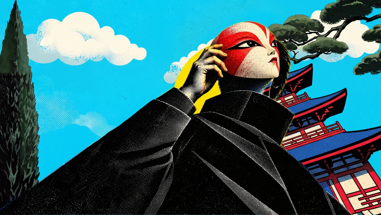
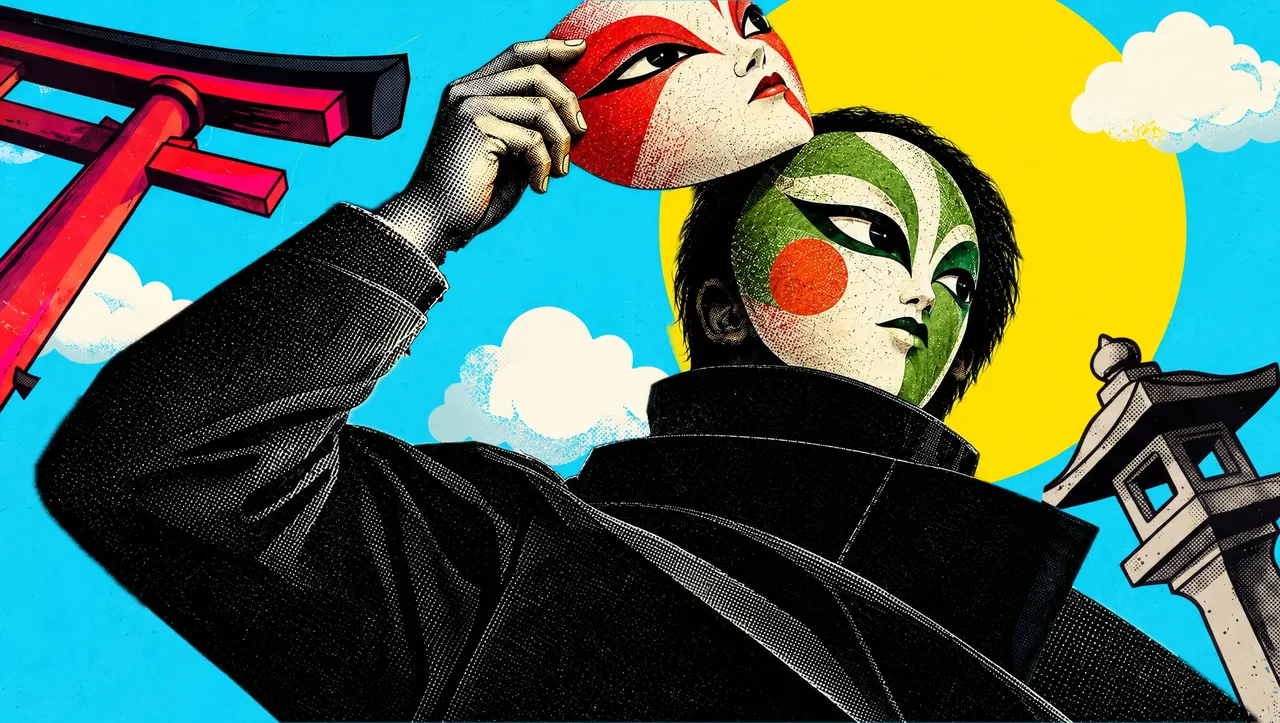
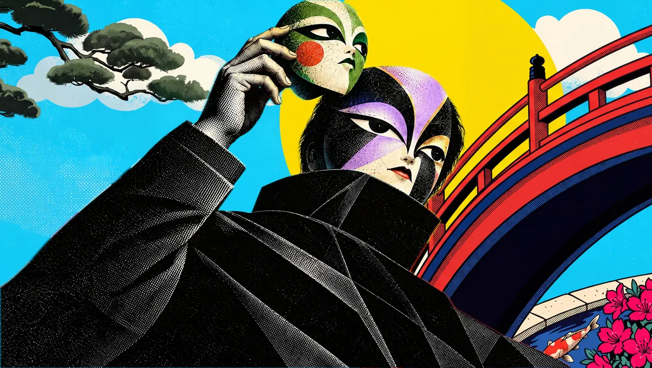
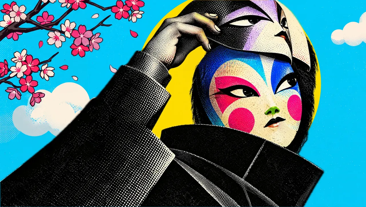
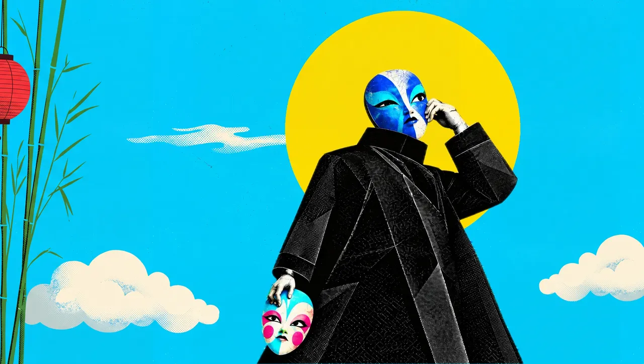
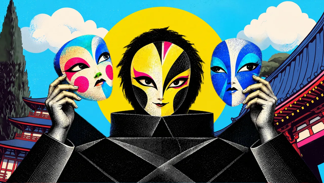
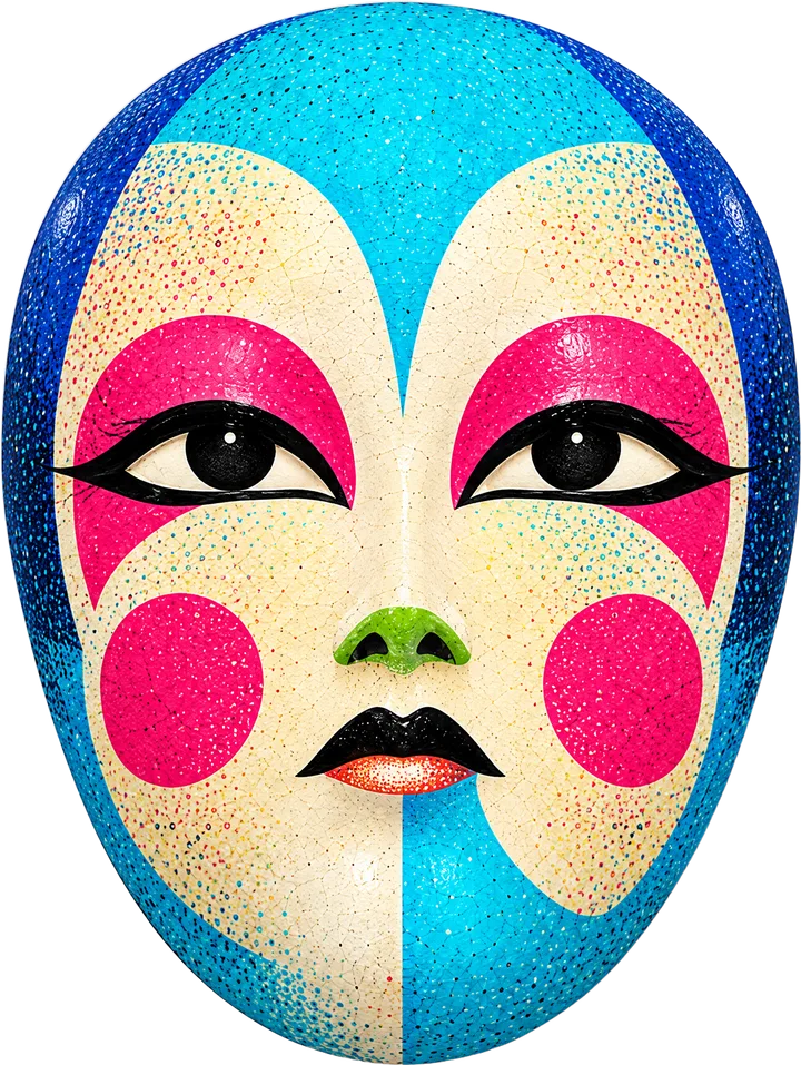
It is the same reason our own identity is a set of painted masks rather than a single symbol. HAIKUU works across strategy, software, products, facegiving, content and websites, and we wanted each discipline to have a face of its own while plainly belonging to the same family.
If you are about to start a brand, try answering the five questions on one page. If you would like help with the answers, start a project.