






Brand identityConfectionery and café

A single line, drawn like pulled caramel.
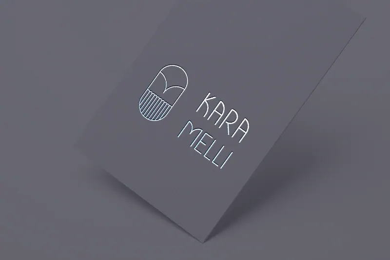
Karamelli’s mark is one continuous monoline: an arch that becomes a drop, its lower half combed into fine vertical strokes.
The name splits into two stacked syllables, KARA over MELLI, set in a tall, airy letter that leaves room around it, the way good packaging lets the product breathe.
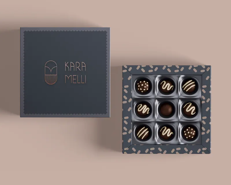
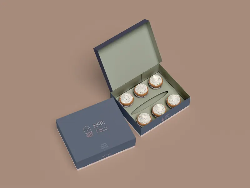
Deep aubergine and soft greys keep it evening-quiet, so the gold of the sweets and the steam off a cup do the talking.

Karamelli · 5 applications
After Karamelli
Have a brand in mind?
Tell us about it.